Actipro Gauge for WPFCircular, linear, digital gauge, LED, and switch controls natively written for the WPF framework. Each control is fully customizable and is packed with features. |
Actipro Gauge is a set of circular, linear, and digital gauge controls, along with LED lights and toggle switches, for the Windows Presentation Foundation framework. Each control has tons of options available, providing for limitless possibilities.
These controls are ideal for displaying several data points in a concise and compact area. Everything from car dashboards to medical and industrial equipment use gauges, and are quickly recognized and understood by users. Circular GaugeCircularGauge can be used to recreate everything from analog clocks to speedometers, seen in everyday life. Using multiple pointers or scales you can present several data points all from a single gauge control. FramesThe CircularGauge control supports several types of built-in frame rims and backgrounds, whose colors and styles can be configured independently. This allows you to mix and match the various effects supported by each to suit your needs.  Two CircularGauge controls with dark semi-circle frames Glass EffectAn optional glass effect can be used that produces a more stunning and realistic look. 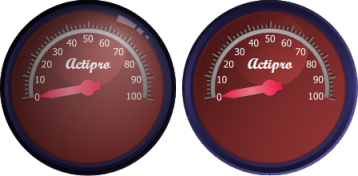 CircularGauge shown with (left) and without (right) the glass effect Custom FramesIn addition to the built-in frames, a completely custom frame can be used to achieve a unique look using a custom geometry or image. Full customization of the frame can be achived using WPF drawing contexts and custom rendering logic. Scales and TicksAny number of scales can be added to the CircularGauge control, which determine the overall placement of the gauge elements, such as tick marks and pointers. In turn, any number of tick-sets can be can be used, which determine value ranges and intervals, such as where major ticks should be rendered. This allows you to precisely display multiple pieces of information in a single gauge. Tick Marks and LabelsLabels or marks can be added, or excluded from, anywhere along a scale based on a given value. The display properties of each can be configured independently, such as marking "55" MPH in red text on a speedodometer. RangesTo highlight areas of interest, ranges can be added with identifying colors. For example, a range with a dark red background can be added to a tachometer that encompasses 6,000 to 10,000 rpms. 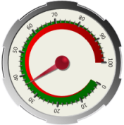 CircularGauge with two different types of ranges Start and End ExtentsIn addition to the start and end values, the thickness of the range at the start and end is completely customizable. This allows you to create ranges that get thinner or thicker as you move along the gauge. PointersCircularGauge supports four distinct pointer types, needle, mark, bar, and label. Any number of pointers can be included in a single gauge, which can present different values (either static or live). All pointers support smooth animation of value changes, providing for a more visually appealing effect. Dampening and Refresh RateAll the pointer types support configurable dampening and refresh rates. Dampening prevents the pointer from jumping around as the value changes and make it seem more realistic. The refresh rate can be used to limit how quickly the pointer updates it's position based on value changes. This gives the end-user a chance to read the current value when lots of changes are made per second. User InteractionThe pointers fully support user interaction, which allows the end-user to drag the pointer to a new value/location. With the optional snapping feature enabled, the values entered by the end-user can be automatically rounded. Additional FeaturesEmbedding ControlsAny UIElement-derived object can be embedded and precisely positioned inside the CircularGauge control, and this includes other gauge controls. For example, a DigitalGauge can be embedded inside a CircularGauge and, using WPF data-binding, can show a textual representation of the current value. Dynamic SizingThe control supports being resized dynamically, so that the inner elements resize proportionally. This is accomplished by specifying percentage-based sizes, but fixed-based sizes can be used if desired. 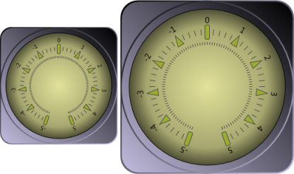 CircularGauge that uses proportional sizing Vector RenderingUsing the WPF rendering engine and precisely placed geometries, the control can scaled to any size without losing resolution. 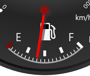 A replication of a fuel gauge zoomed 500% Average, Minimum, Maximum ConvertersUsing WPF data-binding, the average, maximum, and minimum values can be shown using value converters provided. The running average for all values can be calculated using only a few bytes of memory, or you can limit the number of values used for calculation. Linear GaugeLinearGauge can be used to recreate everything from rolling scales to thermometers. Orient the gauge either horizontally or vertically and everything will automatically adjust (with the exception of embedded controls). FramesThe LinearGauge control supports several types of built-in frame rims and backgrounds, whose colors and styles can be configured independently. This allows you to mix and match the various effects supported by each to suit your needs. Glass EffectAn optional glass effect can be used that produces a more stunning and realistic look.  LinearGauge shown with (left) and without (right) the glass effect Custom FramesIn addition to the built-in frames, a completely custom frame can be used to achieve a unique look using a custom geometry or image. Full customization of the frame can be achived using WPF drawing contexts and custom rendering logic. Scales and TicksAny number of scales can be added to the LinearGauge control, which determine the overall placement of the gauge elements, such as tick marks and pointers. In turn, any number of tick-sets can be can be used, which determine value ranges and intervals, such as where major ticks should be rendered. This allows you to precisely display multiple pieces of information in a single gauge. Tick Marks and LabelsLabels or marks can be added, or excluded from, anywhere along a scale based on a given value. The display properties of each can be configured independently, such as marking 100 degrees Fahrenheit in red text on a thermometer. Rolling ScalesAs an alternative to having the pointers move as the value changes, the scale/ticks can be moved behind a fixed pointer. This gives the illusion of a real world rolling scale.  LinearGauge replicating a rolling scale with a fixed pointer RangesTo highlight areas of interest, ranges can be added with identifying colors. For example, a range with a dark red background can be added to a thermometer at or above the boiling point of water.  LinearGauge with a green and red range Start and End ExtentsIn addition to the start and end values, the thickness of the range at the start and end is completely customizable. This allows you to create ranges that get thinner or thicker as you move along the gauge. PointersLinearGauge supports three distinct pointer types: mark, bar, and label. Any number of pointers can be included in a single gauge, which can present different values (either static or live). All pointers support smooth animation of value changes, providing for a more visually appealing effect. Dampening and Refresh RateAll the pointer types support configurable dampening and refresh rates. Dampening prevents the pointer from jumping around as the value changes and make it seem more realistic. The refresh rate can be used to limit how quickly the pointer updates it's position based on value changes. This gives the end-user a chance to read the current value when lots of changes are made per second. User InteractionThe pointers fully support user interaction, which allows the end-user to drag the pointer to a new value/location. With the optional snapping feature enabled, the values entered by the end-user can be automatically rounded. Additional FeaturesEmbedding ControlsAny UIElement-derived object can be embedded and precisely positioned inside the LinearGauge control, and this includes other gauge controls. For example, a DigitalGauge can be embedded inside a LinearGauge and, using WPF data-binding, can show a textual representation of the current value. Dynamic SizingThe control supports being resized dynamically, so that the inner elements resize proportionally. This is accomplished by specifying percentage-based sizes, but fixed-based sizes can be used if desired.  LinearGauge that uses proportional sizing Vector RenderingUsing the WPF rendering engine and precisely placed geometries, the control can scaled to any size without losing resolution. 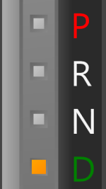 A replication of a gear shift display using LinearGauge zoomed 500% Average, Minimum, and Maximum ConvertersUsing WPF data-binding, the average, maximum, and minimum values can be shown using value converters provided. The running average for all values can be calculated using only a few bytes of memory, or you can limit the number of values used for calculation. Digital GaugeDigitalGauge can be used to recreate segmented led displays, such as odometers in modern cars, airplanes, and calculators. FramesThe DigitalGauge control supports several types of built-in frame rims and backgrounds, whose colors and styles can be configured independently. This allows you to mix and match the various effects supported by each to suit your needs. Glass EffectAn optional glass effect can be used that produces a more stunning and realistic look.  DigitalGauge shown with (left) and without (right) the glass effect Custom FramesIn addition to the built-in frames, a completely custom frame can be used to achieve a unique look using a custom geometry or image. Full customization of the frame can be achived using WPF drawing contexts and custom rendering logic. Character DisplaySeveral ASCII characters and all numbers can be displayed using 7 or 14 segments, a special trapezoid version with 7 segments, or dot matrix layouts. Certain characters, such as period and colon, are rendered in the space between characters. Italic characters can be replicated using built-in skew transform support.  DigitalGauge showing 'Actipro' with 7 segments (left) and 5x7 matrix (right) Size and CountThe width and height of the characters can be customized as needed, or can be automatically determined based on the size of the gauge. Additionally, the number of characters displayed can be easily configured. Refresh RateBy default, value changes are immediately reflected in the control's diplay. If there are several updates per second, it becomes difficult to read the values as they flash by. Increasing the refresh rate restricts the number of display updates and gives the user a chance to read the values as they change. Scrolling and AlignmentThe DigitalGauge can align the text displayed to the left or right, or it can scroll using a configurable interval. This allows long text to be presented to the end-user using a marquee effect. DigitalGauge with a scrolling marquee Additional FeaturesEmbedding ControlsAny UIElement-derived object can be embedded and precisely positioned inside the DigitalGauge control, and this includes other gauge controls. For example, a LinearGauge can be embedded inside a DigitalGauge to display progress for an long running operation. Vector RenderingUsing the WPF rendering engine and precisely placed geometries, the control can scaled to any size without losing resolution. LED and Toggle Switch ControlsThe Led control is great for presenting simple state (on, off, blinking) information to the end-user. While the ToggleSwitch control works much like the native WPF ToggleButton, but looks like a real-life switch. LEDThe Led control can be used to recreate a real world LED light, which can be turned on and off, or set to blink using a configurable interval. Transitions between the various states are fully animated. 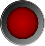 Led with a red circle light LightThere are several options available which configure the shape, size, and colors of the Led light. This can be used to adjust the intensity of the light, to better grab the end-users attention.  Led with a green up arrow light Additional FeaturesThe Led control supports the same frames and additional features as the CircularGauge control, which include embedding any custom control, vector drawing, and dynamic sizing. Toggle SwitchThe ToggleSwitch control can be interactively toggled by the end-user, with support for three state (on, off, and indeterminate). The ToggleSwitch is fully animated and customizable, with two (circular and flat) styles from which to choose. 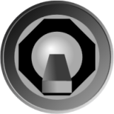 ToggleSwitch with a flat knob in the off position SwitchThere are several options available which configure the shape, size, and colors of the switch.  ToggleSwitch with a circular knob in the on position Additional FeaturesThe ToggleSwitch control supports the same frames and additional features as the CircularGauge control, which include embedding any custom control, vector drawing, and dynamic sizing. |


