Actipro Editors for WPFA control suite that implements several data entry controls for WPF, including a masked textbox and parts-based editors. Built-in parts-based editors are provided for many .Net types, such as brushes, colors, and dates/times. |
Actipro Editors is a control suite that implements several data entry controls for the Windows Presentation Foundation framework, including a masked textbox and parts-based editors. Each control has numerous options available and allows for a more intuitive/natural data entry. The masked textbox can be used to restrict user input to a preconfigured regular expression mask, with support for alternations and quantifiers. Parts-based editors allow the various "parts" of an associated type to be modified individually, such as entering only the month part of a date. Numerous parts-based editors are provided for existing .NET types, including brushes, colors, and dates/times. Helper assemblies are included to make integrating Editors intoDataGrid, PropertyGrid and Ribbon a breeze. Edit BoxesParts-based editors uses individual controls, called parts, to present and modify discreet values in an associated object or objects. Several default implementations are provided for common .NET types, or you can build your own. Built-In Edit BoxesDate/TimeThe DateTimeEditBox and TimeSpanEditBox can be used to update the parts of a DateTime or TimeSpan, respectively. Both controls allow you to easily specify how the parts should be displayed using standard or custom format strings. A DateTimeEditBox with the custom format string: dd/MM/yy 'at' hh:mm The drop-down of the DateTimeEditBox selectively includes a calendar and/or clock, which can be used to update the value as well. The controls used in the drop-down are can be easily customized or completely replaced. NumericThe In32EditBox, Int64EditBox, and DoubleEditBox can be used to update an Int32, Int64, or Double value, respectively. These controls support the standard format strings, which allow you to specify various aspects of how the value is displayed. A calculator is used as the default control for the associated drop-down, which can be used to interactively calculate a new value. Brushes/ColorsThe BrushEditBox and ColorEditBox can be used to easily and intuitively input a Brush or Color, respectively. The drop-down controls include a color specturm control and associated color component sliders. The alpha component can be optionally displayed or modified. 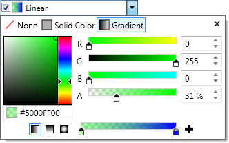 A BrushEditBox editing a linear gradient brush The BrushEditBox includes full support for linear and radial gradient brushes. EnumerationThe EnumEditBox can be used to modify an enumeration value. In most cases, the list of possible values can be automatically gathered, including support for flag enumerations. 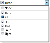 An EnumEditBox modifying a flags enumeration value OthersOther built in parts-based editors include CornerRadiusEditBox, GuidEditBox, Int32RectEditBox, PointEditBox, RectEditBox, SizeEditBox, ThicknessEditBox, and VectorEditBox. CustomizationSeveral type-specific implementation of the parts-based editor are provided. These controls can be used as-is or as the basis for a custom control. In addition, you can build a parts-based editor for any custom types you may have using the existing framework. A complete example showing how to build a parts-based editor for U.S. Social Security Numbers is included in our Sample Browser. Additional FeaturesDefault and Custom ItemsEach type-specific implementation of the parts-based editor includes several default items, such as a drop-down button (like in a ComboBox) and spinner buttons. In addition to these default items, any number of custom items can be added, through XAML or a code-behind file. A DateTimeEditBox with a custom delete button to the left of the drop-down button Custom items are intermixed with the default items, and their order can be quickly and easily customized. For example, you can insert a custom button before, after, or in between any of the default items. Drop Down ContentThe drop-down of all edit boxes can be fully customized, but default content is defined for most edit boxes. Null ValuesAll type-specific parts-based editors support null values, with value-types leveraging the Nullable class. An optional check box is included as a default item, which can be used by the end-user to set the associated value to null. In addition, an initial value can be specified which is used to initialize the associated value from null, when the end-user checks the associated check box or enters a value in an associated part. A GuidEditBox with it's default null content displayed Special null content, also known as a watermark, can be displayed when the associated value is null. This content is fully customizable through the use of a DataTemplate or DataTemplateSelector. This allows you to include controls such as buttons or images, or to handle certain events, such as mouse hover. Spinner ButtonsNearly all of the parts provided can have their associated value incremented or decremented using the default spinner buttons or by using the up/down arrow keys. The Int32 and Double parts-based editors also provide a step value, which is used when incrementing or decrementing. Minimum/Maximum ValuesMinimum and maximum values can be specified for most of the type-specific parts-based editors. For integral types, such as DateTime, Int32, and Double, the meaning and use of the minimum and maximum values is obvious. For aggregate types, such as Point, Rect, and Size, the minimum and maximum values can be used to restrict the individual parts. For example, using a minimum of "0,-10" and a maximum of "10,0" in a PointEditBox will restrict the X value to the range 0 through 10 and the Y value to the range -10 through 0. ControlsNumerous controls are included which can enhance user input, such as masked input, date/time selection, ratings, and much more. MaskedTextBoxMaskInput into a MaskedTextBox is restricted to a specified regular expression mask. If the user types any characters that would violate the regular expression, then it will be ignored. The regular expression can include alternations (e.g. "(One|Two)") and/or quantifiers (e.g. "\d*"), which makes it extremely flexible. PromptsOne or more prompts can be displayed when additional input is required. Any character or Geometry can be used for prompting, giving you full control over the look of your control. You have complete control over the brush used to render the prompts and when they are rendered (always, only when the control has focus, or never).  A MaskedTextBox with a default and custom Geometry prompt, and underscore character prompt Custom ValidationWhen the regular expression is not sufficient, you can apply custom validation or value coercion. The TextChanging event allows the underlying text to be checked and/or altered before it is committed. In fact, many of the parts-based editors leverage this functionality to ensure valid data is entered. MonthCalendarSelectionSeveral selection modes are supported, which mimic the feel of the ListBox selection modes. Single selection allows only one date to be selected at a time, and the selection follows the focused date. Multiple selection allows several non-contiguous dates to be selected without having to hold down the Control and/or Shift keys. Extended selection works like single selection, but allows additional dates to be included by hold down the Control and/or Shift keys. Finally, Range selection works like Extended but requires the selected dates to be contiguous (not counting disabled dates). 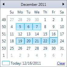 A MonthCalendar with two ranges selected using the Extended mode Additional selection logic can be implemented by handling the SelectionChanging event, or you can cancel the selection change all together. Disabled DatesThe selection can be restricted to certain dates using several options. A minimum and maximum date can be specified, thus disabling any dates outside the given range. This also has the effect of preventing the end-user from navigating outside the specified range. Individual days of the week can be disabled, thus preventing them from being selected. This allows you to prevent weekends from being selected (e.g. Saturday and Sunday). In addition, individual dates or ranges can be disabled as needed. Custom Item StylesEach item of the MonthCalendar control can have a custom Style applied to it. In addition, a StyleSelector can be used for more complex logic such as making the text of odd numbered Tuesdays bold. Styles can also be applied to month items, year items, etc, so you are not limited to just the day items. 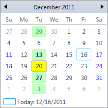 A MonthCalendar with custom styles for individual dates AnalogClockThe AnalogClock control can be used to display and interactively update the time portion of a DateTime value. When enabled the hands can be dragged with the mouse to set a new time. 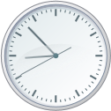 An AnalogClock with the second hand and ticks visible CalculatorThe Calculator can be used by end-users to interactively calculate numeric values. Three different display modes are supported, which include minimal, basic, and standard. 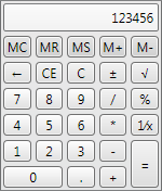 The Calculator control in the standard display mode CountryComboBox/CurrencyComboBoxThe CountryComboBox and CurrencyComboBox controls can be used to provide country and currency selection in your application, respectively. A list of countries and currencies are displayed, as defined by the ISO. This includes the name, a two-letter code, and for currencies, the associated symbol.  A CountryComboBox (left) and a CurrencyComboBox (right) EnumListBoxThe EnumListBox control automatically presents the values of an enumeration with a more intuitive interface. Bind to an enumeration property and the control will automatically determine the possible values and display them appropriately. 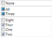 An EnumListBox control presenting a flags enumeration Full support for flags enumerations, which displays values using three-state check boxes. Zero and unioned enumeration values can be displayed separately from individual enumeration values. RatingThe Rating control renders glyphs that can be used present an average rating or collect a user rating. By default, professional star glyphs are used, but can be fully customized. Includes support for both vertical and horizontal orientations and any number of items/stars. A Rating control showing a user rating of 4 out of 5 SpinnerThe Spinner control includes two buttons which can be used to increment and decrement a value. Includes support for both vertical and horizontal orientations and is fully themed. InteroperabilityThe controls can be used separately, or they can be easily integrated into various other controls. PropertyGridThe Actipro Editors controls can be easily integrated into the Actipro PropertyGrid using a special Interop assembly. The Interop assembly provides several default property editors, which are used by the PropertyGrid control to associate a control (or DataTemplate) with one or more properties. Samples are included that show how to accomplish this, or to build your own custom property editors.  A PropertyGrid control with the BrushEditBox integrated using the Interop assembly RibbonThe controls provided by the Editors product can be easily integrated into the Actipro Ribbon using a special Interop assembly. The Interop assembly provides Ribbon compatible styles for the Editors controls, which allows them to blend in seemlessly with the existing Ribbon controls. 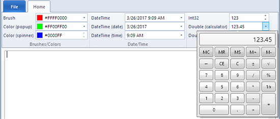 A Ribbon control that has several Editors controls in its groups DataGridThe controls provided by the Editors product can be easily integrated into Microsoft's WPF DataGrid using a special Interop assembly. The Interop assembly provides several custom DataGridColumn objects, which are used by the WPF DataGrid control to associate a control with a column. Samples are included that show how to use the controls provided by the Editors product with the WPF DataGrid.  DataGrid with Editors integrated using the Interop assembly |


